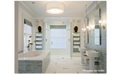
Perhaps because of this dilemma, I imagine it must be great fun as a designer to express or illustrate so many different sides or styles of design. Sure, there's something oddly reassuring about a so-called trademark style. For example, there are some rooms that scream, "yes, that is a Miles Redd room." (though a glance through his portfolio may challenge some of our notions). Phoebe Howard rooms are very Phoebe to me- and I'm not sure I'd want it any other way (I LOVE Phoebe).
But here are a few examples of what I'm calling "Designer Split Personality" and in no way am I trying to be disrespectful. Admittedly, this is less about true styles or types, like midcentury modern, traditional, or my least-favorite term, transitional, but rather about the feel of a room.
First example- Sarah Richardson Design. I admit I had my own ideas of what I thought constituted Sarah Richardson Design. On the edge of rustic, a country European feel.
But then I saw these rooms. Did anyone else stop to take a second look, at these?Amanda Nisbet also provides a lot of variety. Yes, lots of color pops in her room with fun and funky...


But she does elegant glamor just as well...


I also have very definitive ideas about Jamie Drake's designs. COLOR and very hip.


But check out these more muted rooms... the first illustrating a definite shift in style.


Ruthie Sommers portfolio is all over the board (pardon the pun) with some spaces I adore, and others are just not my favorite.
She has dark bold rooms with a "global" feel...

to streamlined updated traditional..


 And Romantic "country" or European style.


Michael S. Smith differentiates among Beach House, Town Home, and High Rise, which give hints at different styles.
The City...

 And The Country

So what do you think? Do you "buy" my theory of different personalities being represented? Can you see consistent themes of each designer throughout their work? Who else would you add to the list?
-Emmie


